And Four Buildings That Use Feng Shui Design Principles
By Ben Coorey
Feng Shui has influenced building designs for millennia. This article examines its origins and core principles. It also looks at some modern buildings that Feng Shui’s principles have influenced.
It’s likely that you’ve at least heard about Feng Shui, even if you haven’t actively studied it. The practice, which some refer to as “geomancy”, finds its origins in China. There, town planners and building designers have followed Feng Shui principles for about 6,000 years.
Feng Shui literally translates to “wind and water”. The practice aims to promote harmony and happiness through design. The idea is to optimise buildings in all aspects to bring about these feelings. This includes optimising the internal and external spaces, as well as garden spaces. Feng Shui can even extend to urban planning, with some town planners taking it into account on a larger scale.
At its core, Feng Shui calls on you to place objects in such a way as to allow for the flow of Qi. This is a natural energy that some cultures, particularly the Chinese, believe flows through everything.
A building’s layout, colours and materials affect the flow of Qi. So too does the placement of all of the objects inside the building.
Feng Shui used to be a closely-guarded secret. Its masters traditionally resided in the Chinese Imperial Court and weren’t allowed to spread their knowledge. That meant that Feng Shui’s secrets only got passed down between father and son for many generations.
However, modernisation brought with it more freedom. Feng Shui has spread throughout the world and many modern designers use it.
Here, we’re going to look at four buildings that Feng Shui principles have influenced. But first, let’s dig deeper into the core principles of the practice.
The Core Feng Shui Principles
The problem with such an ancient concept is that it’s sure to get fractured over the years. That’s the case with Feng Shui, as there are several schools of thought related to the subject.
In modern Feng Shui, two schools take prominence:
- The Compass School
- The Form School
The Compass School focuses on the eight mansion, or eight cardinal directions. Each of these directions has its own Qi energy, which a designer must take into account. To do this, they use the Luo Pan. This is a disc that’s built around a Feng Shui compass. There are several concentric circles on the face of this disc, each of which has its own formula. The Luo Pan specifically refers to the Earth’s electromagnetic field. Feng Shui practitioners note that this field holds all matter together.
Architects often use this school during the conceptual design phase.
The Form School is perhaps the one that most associate with Feng Shui. It focuses on the environment’s shape in order to find a location that has good Qi energy.
It takes several things into consideration. These include the important events that relate to a space or structure and the concept of yin and yang. This school also incorporates the Five Elements Theory. It examines the relationship that the following elements have to the space:
- Fire
- Earth
- Wood
- Water
- Metal
The positioning of these elements makes a huge difference. You could create either a constructive or destructive cycle based on your choices.
In the destructive cycle, these elements cancel each other out. Water extinguishes flame, metal slices through wood, and so on.
On a constructive cycle, these elements create a harmonious environment. Water becomes the source of moisture that wood, in the form of trees, needs to grow. This wood becomes the fuel that fire needs. The ashes of the fire fuel the earth, and so on.
Achieving a constructive cycle is the main aim in the Form School.
Most modern Feng Shui practitioners combine these two schools of thought in their work. Furthermore, they take the three core principles of the practice into account. These are as follows:
- Qi Energy. As mentioned earlier, this is the energy that flows through all living things. It’s always flowing, much like water. However, also like water, it’s possible to block the flow of Qi. If this happens, the blocked Qi can have a negative effect on the environment. The aim is to ensure Qi flows without obstruction at all time.
- The Natural Elements. We covered most of these in explaining the Form School. However, there are other elements, such as air and space. Each of these elements has its own set of attributes. These include colour, texture, and shape. Achieving balance between them creates a flow of positive energy.
- The Bagua. This is a concept that doesn’t relate as closely to architecture as the other two principles. Instead, it relates to the placement of the objects that represent your life’s journey within a space. A Bagua is a chart that maps out your energy centres as they relate to a space. It’s grid-based, with each part of the grid representing an aspect of your life. These includes things like power, fame, and family, among many other aspects. You use the Bagua to achieve balance between all of these things, thus allowing you to lead a happy life.
While it all sounds somewhat esoteric, many modern designers follow these principles in their work.
This covers some of the basics. They are entire schools of study devoted to Feng Shui.
Now, let’s look at some of the more famous buildings that use the principles of Feng Shui.
Building #1 – The HSBC Building (Hong Kong)
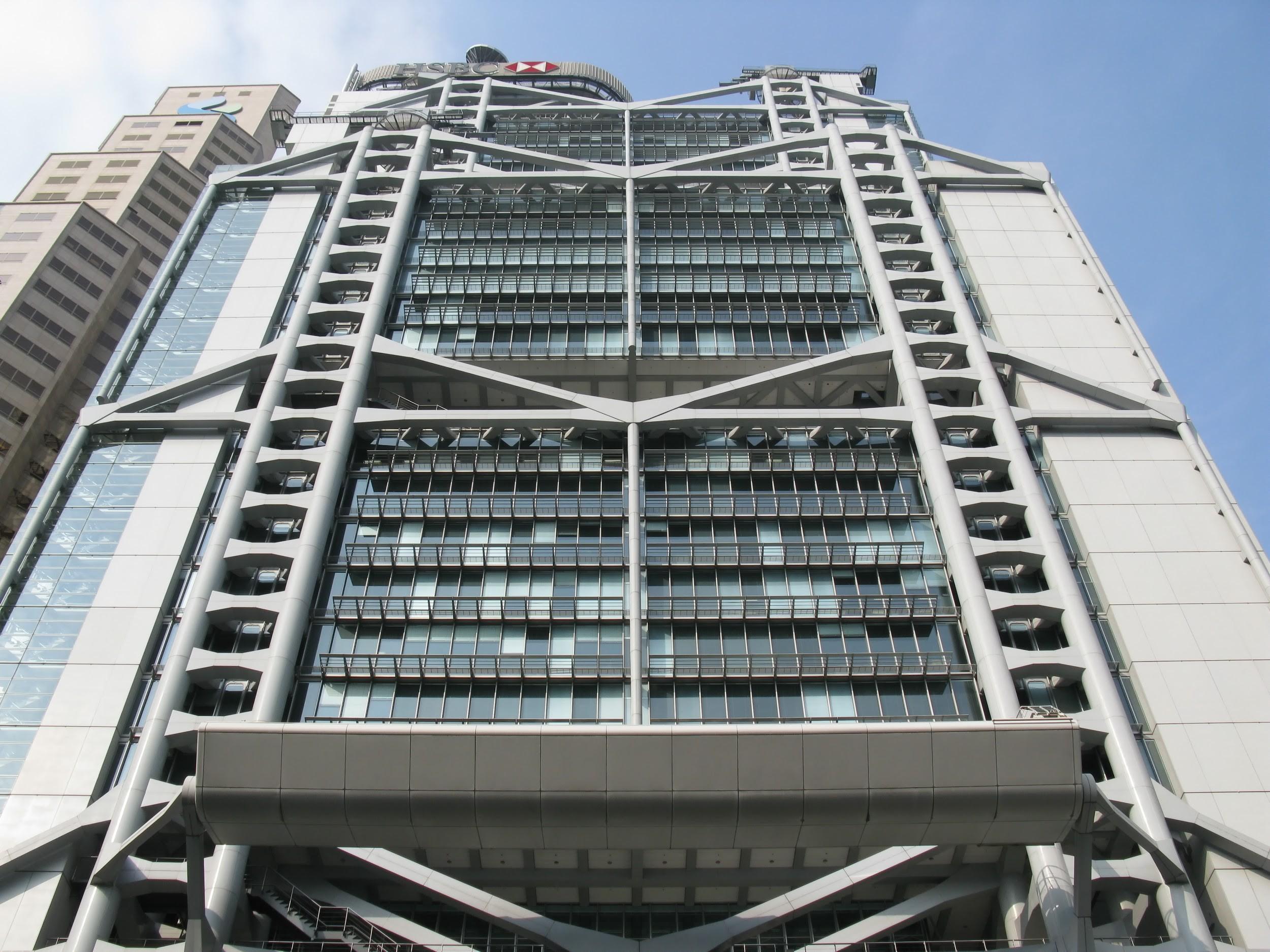
The British firm Norman + Partners designed the HSBC Building in Hong Kong. They decided to consult several regional Feng Shui masters as part of their work.
This resulted in an interior design that prioritise open spaces. The tall and hollow atrium that takes up much of the ground floor is a standout feature of this building. It allows for the free flow of wind through the building’s interior. This invites more positive Qi into the building.
The angled design of the escalators also plays a role in how the building’s interior directs Qi energy. They’re intended to deflect the flow of bad energy, thus ensuring that it doesn’t reach the upper floors of the building.
The Bagua also comes into play with the placement of two bronze lions at the entrance. These symbolically guard the building as well as symbolising prosperity.
As an interesting postscript, the designers added more to the building later on. The nearby Bank of China Tower threatened to disrupt the flow of positive energy to the HSBC Building. The designers responded by installing a pair of cannon-like instalments on the building’s roof. Much like the lion statues below, these protect the building from the flow of bad Qi energy.
Building #2 – The Apple Store (London)
The Apple Store at Regent Street is the busiest of the company’s stores. Its prime location plays a role in this, but you may not realise the role that Feng Shui has to play.
The store’s location is the first thing to take note of. It’s on a slight bend in Regent’s Street, which some consider a Qi energy sweet spot. This is due to its proximity to the nearby Regent’s Park.
Positive Qi energy flows towards the building and enters at an angle. It then flows in a clockwise direction throughout the store.
It’s here that the building’s interior design comes to the fore. The Apple Store’s design ensures that this energy can flow in a clockwise manner throughout the store. There are interior walls that could block the flow. Instead, the building uses an open floor plan design that also contains several trees. The benches that display Apple’s products are also small enough to ensure they don’t obstruct the Qi flow.
These design choices enable the clockwise flow of the energy. And that works to Apple’s benefit.
In the Northern Hemisphere, water moves in an anti-clockwise direction. When Qi energy mirrors this flow, you create a comfortable atmosphere.
Regent Street’s Apple Store reverses this concept. It encourages Qi to flow in a clockwise direction to encourage confusion. This confusion may lead to people making more impulse purchase. It can also make them more susceptible to sales pitches and events. The idea is to prevent people from thinking logically. In this state, they make more decisions based on their desires, which is a good thing for the store.
This appears to work too. Apple’s Regent Street store makes £3,250 (approx. $6,000) of sales per square foot on an annual basis. This is a higher number than almost any other store in London achieves.
Building #3 – The Bank of China Tower (Hong Kong)
The Bank of China Tower would have previously been a poor example of a building that uses Feng Shui. In fact, it gained infamy in Hong Kong for ignoring Feng Shui principles in favour of post-expressionist design. It’s this building that necessitated the building of the cannons on the HSBC building.
The building’s angular structure was a major sticking point. Many believed that these angles sliced through good Qi, thus projecting bad Qi to the surrounding buildings.
These beliefs spread further thanks to several unfortunate events that took place after its erection. The owner of the Lippo Centre, which is a building that stands near to the tower, experienced financial ruin. Plus, Hong Kong’s governor passed away in the nearby Governor’s House. All of this added fuel to the idea that The Bank of China Tower projected bad Qi energy.
It’s the response to these beliefs that earns the tower its spot on this list. Facing mounting public pressure, the building’s owner took steps to achieve balance again.
The owners installed a small waterfall inside the building. They lined this with several large rocks, which they imported directly from China. These new features represented harmony and stability in an effort to offset the negative effects that the building’s design had on Qi. The addition of several trees in the surrounding area served a similar purpose. They’re an environmental purifier, which means that they help in generating good Qi.
Building #4 – The Sydney Opera House (Australia)

One of Australia’s most famous buildings also has a Feng Shui element to it. In fact, many would argue that its construction involves several Feng Shui conflicts.
On one hand, the building makes use of an angular design. However this isn’t as harsh as the design used in the Bank of China Tower. Instead, the design leads to its classification as a fire-type building. That makes it a good choice for housing the arts and other creative ventures.
On the other, it’s also completely surrounded by water. As established earlier, this creates destructive Feng Shui as water douses flames. Some believe that this could lead to tensions within the building due to this destruction of harmony.
It appears that the designers took no steps to counter this disharmonious design. Perhaps a design that creates tension benefits a building that houses creative performances.
The Final Word
There may be a great deal of superstition attached to Feng Shui. Some may not follow the concept of building and interior design influencing the flow of Qi energy.
However, it’s a cultural concept that has continued unabated for 6,000 years. It continues to have a heavy influence in China and Hong Kong, as you can see from the buildings in the above list. Plus, Feng Shui’s influence has spread much further over the last few centuries. Its principles influence many designs, both exterior and interior, in the modern world.
The Archistar team recognises this, which is why the platform includes a Feng Shui analysis feature. It incorporates over dozens of Feng Shui rules and functions to generate reports. Simply upload your floor plan and answer a few questions that the platform poses. You’ll generate an instant Feng Shui analysis for your floor plan.
That goes alongside all of the other benefits that Archistar Property has to offer. The platform makes use of artificial intelligence and Big Data to generate reports for developers and designers. You can locate development hotspots and create conceptual designs in a matter of hours.
Archistar saves weeks’ worth of manual work. Plus, it can help you maintain balance and harmony in your buildings. To learn more, get in touch with the Archistar team today.


